Thursday, 17 March 2016

Music Video Analysis (Gum by Moose Blood)


The music video for Moose Blood's song 'Gum' was released onto Youtube on May 19th 2015. The video relies heavily on narrative which illustrates the content of the lyrics, however it is also performance based, with the band making appearances throughout in the form on them performing the song on the male character's front garden and also in his bedroom, where he is seen listening to their music and with a banner for the band on the wall. These star appearances are requested by the record labels in order to give the audience a sense of connection to the band.


The video features a hazy aesthetic which is echoed throughout all of their music videos and is almost a motif for the band itself. Another thing feature that could be considered a motif would be the fairy lights that are heavily featured in the video, and also in all of Moose Blood's videos and live stage performances.  This 'look' that the band has makes them easily identifiable for fans and audiences.


Goodwin mentions in his theory that there are frequent references to the notion of looking and the voyeuristic treatment of the female body. In the music video for 'Gum', an example of voyeurism is at the point in the video in which the male character pulls across the curtain to look out of the window at the female character and also when they are both walking down the street together and the male character is seen just looking at the female character.






Promotional Video and Evaluation


Introduction

After carrying out research on the different types of promotional video, the conventions of a promotional video etc, we were given a brief to find our own client and make a promotional video for them. Beth knew someone who was a tattoo artist who worked in a local tattoo parlour, so we contacted him and asked if we could film a promotional video for their company. The overall aim of the video is to showcase the tattoo artist's work and to promote their tattoo parlour in a positive manner (as there is a lot of stigma attached to tattoos in general and to tattooists and tattoo studios) which will encourage more people to visit and get a tattoo there. 


Planning

After the initial contact with our clients at Hellcats, we began to plan the video out in depth so that we knew exactly what we were doing when we got there. We started watching other promotional videos for tattoo studios on youtube which gave us some insight into what to include, what shots were a good idea etc. We then made some mood boards which were a collection of our initial ideas and made us consider shot types, angles and colour schemes. Next, we created a gantt chart online (teamgantt.com) which ensured that each of us knew exactly what we were doing and at what time; we could also update the chart to show the progress we had made which kept us organised and made sure we kept to a set schedule. As we were planning on travelling to Hinckley for each shoot, we considered the best ways in which to get there and decided on the train. We checked the train times and the prices of tickets each time, as we needed to keep to a tight schedule and a tight budget. Planning the train times meant that we could effectively plan our time at the tattoo parlour and organise which tasks would take the longest etc. We then created a shot list/storyboard which involved taking draft still images of what kind of shot types/angles we wanted to get and in what order we would use them. This was very helpful in the post-production process as it meant we could refer back to it when we were organising the shots. 


What went well

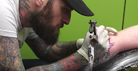
After viewing our final promotional video, I feel that there are many things that went well. We used a wide variety of shot types, camera angles, camera movements and editing techniques, which all combined made for a very aesthetically pleasing video. I particularly like the shots of the tattoo artists at work as we took lots of close ups, extreme close ups etc, which show the detail in their work and their friendly attitude towards their customers.


The editing of the video is fast paced and choppy, matching the loud rock track that we used for the music and echoing the fun and dynamic feel of the tattoo parlour itself. The speed of the edit also makes the video visually exciting as there is so much to look at. 


Improvements 

I think that despite the fact that I am very happy with the outcome of the video, there are definitely some improvements that could be made. I think that the main way in which we could improve the finished video is by including more shots of the artists interacting with each other and with customers to show their friendly, approachable nature and the fun environment that they create. This is really important for a tattoo parlour's promotional video, as there is a lot of stigma surrounding the people that work in the tattooing industry and this would diminish that stigma. I would also maybe include some shots of people in the waiting room to show that the tattoo parlour is popular, thus encouraging more people to visit; we were unable to do this at the time of filming as each time we arrived everyone was already getting tattoos. If we were to film again, we would possibly confirm what time people's appointments were and arrive before them so that we could get footage of people waiting to go in for their appointment. In our plans, we considered filming some artists profiles to give potential customers an idea of the kind of work each artist does. However, due to time constraints we were unable to film any interview set ups, and only some of the artists were present each time we went to film so we were unable to get footage of every artist that works at Hellcats. 
One more thing that I would say did not go as successfully as we had planned was one particular panning shot. Although the shot itself is very effective, the colour of the walls (bright green) created a colour cast on the shots and when we tried to alter the colour balances on premiere pro, it became quite washed out looking. Next time, I would consider adjusting the white balance on the camera to see if that improved the quality of the footage. 


Effective Judgements

Throughout the filming process, Beth and I overcame various issues that we had not predicted beforehand. The major issue we came across was the dingy low-key lighting inside the tattoo parlour, particularly in the waiting room which was where we filmed most of the establishing shots and close-ups. The initial footage we filmed in there was quite grainy and dark, so to solve this issue we began to bring additional light sources (LED Lights) which improved the lighting drastically. We also altered the colour balance, brightness and contrast in post production which improved some of the shots a great deal. 

When it came to choosing the music for the video, we did struggle to find some music that was copy-right free and royalty-free that would fit with the overall feel of the tattoo parlour. We had a specific genre in mind - punk or alternative, as this is the kind of music that one would associate with tattoo parlours, and it is also the kind of music that they actually play inside the shop. We initially wanted to use a track by a Brighton based punk band called Gnarwolves, however we found it difficult to contact them to get their permission to use the song and didn't want any copyright infringements in our work, so we decided to keep looking on some royalty free music websites. We came across a youtube channel that specialised in royalty free music and music for corporate videos so we decided to use a particular track that had a very rock vibe to it. This meant that Hellcats could then post the finished video onto any social media platform that they wanted to and we would be able to publish it onto Youtube without it getting removed. 

Health and Safety/Ethical Considerations

As we were filming with the general public, we had to be even more vigilant when it came to health and safety. We ensured that every body around us was aware that we were filming and that we would be using equipment such a tripods, lights etc which would take up a lot of room. This meant we could avoid anyone tripping over or falling over the equipment and causing injury to themselves and others, and potentially damaging our equipment. We ensured that all equipment was put together safely - we made sure that all lights and cameras were attached to tripods stably and securely so that they did not fall off and break or injure anyone. When not in use all of our equipment was put away neatly and safely, and we kept it out of the way of any walkways and doorways. 


Wednesday, 16 March 2016

Customer Feedback/Comunication

Throughout the production process, Beth and I maintained communication with our clients at Hellcats Tattoo Parlour in order to gain feedback and inspiration from them. This was crucial to the production process as we are promoting their company and therefore we felt that we needed some input from them to ensure that we got the right kind of video for them. 


Below are some example of he ways in which we contacted our clients at Hellcats. We sent them emails to arrange days and times to film, to receive feedback on the work we had done and to ask them to fill out questionnaires and watch the first draft etc. 


Tuesday, 15 March 2016

Release Forms, Health and Safety


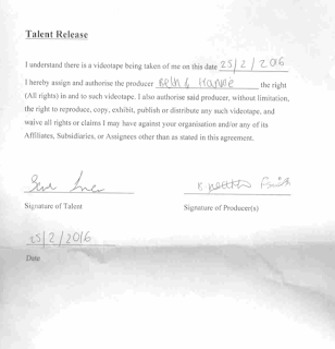
For legal and ethical reasons, Beth and I had to ensure that anyone who's likeness appeared in any of the footage we produced signed a release form. This gave us permission to use, reproduce, copy, exhibit, publish and distribute the footage that they are featured in.


Health and Safety

As we were filming with the general public, we had to consider the health and safety of those involved and those around us. We ensured that everyone in the vicinity was aware that we were present and that there would be equipment set up in the building so that everyone knew to be careful. This prevented any trips or falls that could potentially injure or even damage the equipment we were using. When not in use, all of our equipment including cameras, lights, tripods etc. were put away neatly and correctly so as to not get in anyones way and cause harm to those around us. We had to be careful when filming the establishing shots outside of the shop, as it was next to a very busy road with heavy traffic. 


Thursday, 3 March 2016

Shooting Plan Two

My Ideas

Looking back on the footage that Beth and I obtained from our first shoot, I can see that there are definite gaps in the video that need filling and therefore we need to film more content. For example, at the minute we are lacking in establishing shots which give potential customers an idea of the overall feel of the tattoo parlour, as well as giving them an idea of whereabouts it is located. We are also aiming to get some more close-up footage of artists at work and the tattoos being done. 


Equipment

The equipment we plan to take:


  • Canon EOS 5D Mark II
  • Canon EOS 750D 
  • 4 x Tripods
  • 2 X LED Lights
  • Compact Flash Card
  • 64 GB SD Card
Lighting

The last time that Beth and I visited the tattoo parlour, we did not take any additional lighting with us. However, we discovered that the lighting in the studio was quite low-key and therefore we had to bump up our ISO on the camera which then made some of our footage quite grainy. For this reason, we plan to take at least two additional light sources (LED lights).

Audio

We will not be recording any audio whilst filming for this shoot as we have decided not to include any interviews etc. We do, however, want to include non-diegetic sound in the form of music in our video so we will have to consider copyright laws for that.


Risk Assessment

To ensure the safety of us and those around us, we will make sure that everyone is aware of the equipment we will be using. This will avoid any trips or falls that could cause injury or damage the equipment we are using. 


Tuesday, 1 March 2016

Shoot One Evaluation


During our initial visit to the tattoo parlour, Beth and I encountered a few problems that we had not predicted. Forexample, we had not anticipated that the shop's lighting would be quite dim and as it was our first visit, we had not taken additional lights with us and therefore the footage we took whilst there was quite underexposed. We had to turn the ISO up to 1600, meaning that the overall footage was rather grainy. To solve this issue in future, we plan to take our own LED lights with us, using tripods to direct them. This will enable us to use a lower ISO, meaning less noise in the footage and an overall better quality video. 

Another unexpected problem was the fact that the rooms are considerably smaller than we had anticipated. This meant that we struggled to set up the tripods in some spaces, meaning that some of the footage was handheld and therefore quite shaky which is not desirable at all in promotional videos. We plan to reshoot this footage by asking the permission on the tattoo parlour's staff to move around the furniture slightly so that we can put our tripod's in a more stable position. This will mean that the overall set up will be much safer for all involved, and that our footage will be of a higher quality. 


Below are some examples of footage from this shoot, illustrating the fact that it is all quite grainy and shaky.